Showing posts with label color. Show all posts

Wednesday, December 9, 2015

Color me enchanted! A book review...

I sat down to write this post on 2 books in my art/inspiration/history library that I adore. And found a new book by  the author, Victoria Finlay. I only wonder if I can wait until the holidays to purchase it. You know its on my list right away! OK - back to the regularly scheduled post... 

When I need a go to gift for a friend I turn to the work of author Victoria Finlay. Almost everyone I know would find either of her first 2 books interesting. Gems, history, drama, folktales, color, pigments, each, science, paint, art.... see what I mean? I wanted to introduce these to you, for your list or as gifts... since it IS that time of year. 

First: Color: a natural history of the palette. 

This book is a treat. Divided into the colors of the rainbow it delves into origins, materials, organic sources, scientific methods, history, travel, culture... The author shares her travel tales, her detailed and thorough research, both historical and cultural. Its a behind the scenes look into things that are so familiar and remain a complete mystery!

Color by V. Finlay. Available here

From the back cover: 

  • Cleopatra used saffron - a source of the color yellow - for seduction... 
  • Extracted from an Afghan mine, the blue "ultramarine" used by Michelangelo was so expensive he couldn't afford to buy it himself.
  • Since ancient times, carmine red - still found in lipsticks and Cherry Coke - has come from the blood of insects. 
Snippets from "Color..."
"If you open up a box of paints, there are numerous such stories hidden inside it. There are stories of sacredness and profanity, of nostalgia and invention, of secrecy and myth, of luxury and texture, of profit and loss, of fading and poison, or cruelty and greed, and of the determination of some people to let nothing stop them in the pursuit of beauty." ( page24)


Second: Jewels- A secret History

Jewels by V. Finlay available here
Diamonds, rubies, emeralds, amber, jet... 
Im sure you have heard of the infamous and tragic Hope diamond, of Mikimoto and the first cultured pearls. But what of Whitby, the town jet built? The emerald city of Sikait? The amber washing championships on Jantar, Poland? I didn't think so! These and more tales await you in the pages of "Jewels"! I am the first to admit that I am a "gemstone junkie" and that I most frequently use stones in my beadwork. But this is a multicultural exploration into places, gems, folklore...  that appeals to me on so many levels!
Snippets from "Jewels"

And most recently: The BRILLIANT history of Color in Art

Finalys' newest! Im so excited! On Amazon... 
Looking inside this one on Amazon, I may have actually sealed out loud in excitement. COLOR and ART HISTORY. I am in heaven. Cave paintings! Tyrian purple and Egyptian blue, gilded Medieval painting, sepia photography... 
from the back cover: 
  • Cleopatra made purple the royal color of the Western world. Her favorite was made with rotten shellfish soaked in urine. 
  • Cobalt blue was the key evidence in a infamous trial  involving Nazi collaboration and a forged Vermeer. 
  • Van Gogh used chrome yellow beautifully in his paintings - but he probably shouldn't have eaten it. 
( I searched for this last night at Barnes & Noble. To look, maybe to bring it home... Sadly their one copy wasn't not the shelf. So for now - it remains on my Wish list.) 

I know that was a very biased, enthusiastic review. But if all I achieve is to have you look up these books and consider them... they speak for themselves. Great gifts - for yourself, or your art/jewelry/history/folklore friends! 


Saturday, July 11, 2015

How to Spark Inspiration/Motivation, Part 387-D

So, a short and sweet little lesson in sparking inspiration when you are so absolutely unmotivated you could cry! The last few weeks have been totally stressful for me...my day job has been converting to new financial systems and I have had to focus on training and learning an entirely new way of doing my job, which involves sitting at my desk staring at a computer screen. I have been so mind-weary every day, creativity has been lying dormant.

Today after work I decided to just sit at my bead table and look. There were some things that had been sitting there for a while that I just hadn't played with yet. I pulled out a couple of bags from recent purchases and looked at them. Walked away, came back, walked away, etc...

Small raku-fired beads by Keith O'Connor
I saw this pile of raku beads I got from Keith O'Connor's trunk show at my friends house.I remember loving them so much when I saw the stacks of these he had in almost every color of the rainbow. I wanted some of each, but was strapped for cash so chose pairs of my favs.  I intended to used them as pairs in projects...earrings, probably. When I saw them all in a pile like this, though, I thought...don't fight it! Use them all!

Copper bracelet with Keith's gorgeous beads.
I didn't add anything else, just wire-wrapped them with copper wire and made a quick clasp.  Simple, yet totally effective!  Disclaimer, I used a stupid headpin as my charm that wouldn't patina, so I'll have to go back and fix it!

Karen's gorgeous beads!
The second package I picked up was an auction I won at the Ceramic Art Bead Market on FB from our own dear Karen Totten!  I remember when I bid on them how much this color combination moved me.   I have been looking at them and fondling them for a while.

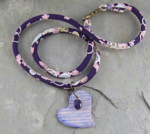
Wrap necklace with Karen's beads, an enameled bead by me, and one of Keith's raku beads.
I have been seeing lots of simple wrap necklaces...beads or other components on each end of a long chain that can be wrapped around the neck or just looped over in front.  I thought this was a cool way to show off gorgeous beads in a different way.  I hope to be creating a few more of these.  Again, pretty simple, yet colorful and unique!

So the crux of today's lesson: You don't have to be inspired or feel creative. Take the time you need. It's okay to walk away from something and come back to it as many times as needed. Trust your first instinct. Take a chance.


Thursday, January 29, 2015

5 Pretty Marsala Color Palettes

As you may have heard, Marsala is Pantone's pick for the 2015 Color Of The Year.  In a previous post, Lesley highlighted some Marsala colored art beads that you may want to incorporate in your designs.
I have heard people complain that they can't quite put a finger on just what this color is.  Its kind of a dusty burgundy hue that lies somewhere between rose and brick.  When I first saw this shade, I could only think to pair it with mauve, but in the meantime, I've realized that it is a lot more versatile than I thought it would be.

If you are a person who struggles with combining colors, you might want to start by looking at color combos in your environment. Fabrics, fashion, house decor magazines, paintings and floral arrangements are all good starting points.

In that vein, I have assembled some collages for you.  Each one starts with a large picture of an object you might see in your daily life.  I've pulled a color palette from that object and then selected beads in those colors.  I hope this inspires you and increases your color confidence.

Pillows are a surprisingly good place to start.  They often combine several colors on a small enough scale that you can visualize it as jewelry. I once made a yellow and gray bracelet inspired by a pillow I saw in a House Beautiful magazine.   Our living room colors were all inspired by one handwoven pillow we have. So pick up a magazine or stroll through a furnishing shop.  Look for a pillow that includes Marsala.  Pay attention to the other colors on the pillow or the colors of the furniture on which it was placed.
 Clockwise:  Pillow from Crate and Barrel, Starry Road Studio, Curious Bead Shop, Fiber Beads, Graceful Willow Beads, Color Square.

I saw this wreath on Pinterest and fell in love with it! I love the angled, sweeping lines and the colors are just so yummy!  I was immediately inspired to create jewelry in these colors.
Clockwise: Wreath from Field and Florist, Captured Memories, Color Square, Wooly Wire Etc., BeadBistroCrafts, Color Square.

Paintings are a wonderful source of inspiration.  You don't necessarily even have to like the artwork.  Just focus on the color combinations.  I found this painting by Monet while doing a Pinterest search for "Marsala art work".
Clockwise:  Painting by Monet, Graceful Willow Beads, Jetta Bug Jewelry, Graceful Willow Beads, Color Square, BobbiThisnThat.

Next time you are wandering through the mall or paging through a women's magazine, keep your eyes peeled for Marsala colored clothing and pay attention to the colors it is paired with.  I love this outfit!  I had fun finding beadie treasures in these colors!
Clockwise: Outfit by LoLoBu, Starry Road Studio, Linda Landig Jewelry, OrlyFuchsGalchenSpawn Of FlameWooly Wire Etc.

I found this dress by doing a Pinterest search for "Marsala fashions".  I think this is my favorite color palette that I found.  The coral accents just make the whole thing sing for me!  Love, love, love this!
 Clockwise: Dress found on Pop Sugar, Classic Bead, Curious Bead ShopLanaBeads2, Beads By Earth Tones, Wooly Wire Etc.

I also found a couple of earrings in Lesley's shop, Thea Jewellery, that fit the bill, so I thought I'd share them as well.


I'm not suggesting that you design jewelry solely with the goal of being on trend, but if you find these color palettes inspiring, then by all means go for it!  And keep your eyes open to all the fabulous color that surrounds you everyday.  Inspiration is everywhere!
Linda 


Tuesday, March 11, 2014

Thinking in Color - Part II


A little over a year ago, I wrote about some of the online tools I turn to when I'm trying to piece colors together. Color theory isn't one of those things I do instinctively (unlike my best friend, Kimmy, who is a natural!) so I've been working on improving my overall design sensibility and digging a little deeper into what makes good design. One aspect of that is how colors work (or don't work) together.

For starters, I invested in two subscription services: Lynda.com and Adobe Creative Cloud. For a very reasonable monthly fee, Lynda.com offers unlimited access to thousands and thousands of training videos on every single topic you can imagine, including web and graphic design, photography, and color theory. Learning is one of those things I don't think I'll ever get tired of and this subscription has turned out to be wonderful for those times when I want to dig a little deeper into something than I can get with a Google search.


The Adobe Creative Cloud membership offers me access to every single one of the programs that are part of the Creative Suite of products - but instead of paying $2,000 or more for the software, I pay a monthly subscription fee that ensures my software is up-to-date at all times. It's a win-win for me - I'm a heavy user of Photoshop and dabble with InDesign and Lightroom, and the subscription winds up saving me a ton of money on the programs I use the most.


But if you're looking for a color design tool that ups your game without a commitment or a financial investment, let me introduce you to Adobe Kuler


Select the color "rule" you want to try from the drop down menu, set your base (or primary) color, and then start moving the pistons in the center of the color wheel. Any change you make in one color results in changes to the others, making sure your colors stay related. You can also tweak individual colors using the sliders below the color blocks for fine tuning. When you come up with something you like, you can set up a free Adobe account and save the color palette to your themes so you can refer to them later.

But one of my favorite features is the ability to create a theme or palette from a photo. Upload a photo and Kuler automatically chooses a palette based on one of five pre-programmed color "moods." (This photo is one of my favorites from a Hawaii vacation we took in 2009.)


All of these themes evoke the overall feel of the photo, but each one has it's own unique vibe - except that the 2nd and 4th palettes are nearly identical. I am really drawn to that taupey grey on the right side of those two - very warm and rich, and not at all a color I would have picked out of this photo.

This photo (another favorite from our Hawaii trip) gets tweaked in a whole different direction.


I love that third palette - it really reads "spring" to me, and is composed of colors that aren't at all what I would have pulled out of this photo.

Honestly, this is one of those toys... uh, I mean tools.... I could spend hours with. It makes me think about colors in a new way, and usually pushes me towards color combinations that are completely outside my comfort zone. I've been trying out some of those color combinations in recent enameling experiments and I hope to have some things to share with you soon.

So what new digital tools are making their way into your studio? Are there new things you're finding you can't do without?

Until next time -


Monday, February 10, 2014

Exploring Polymer Clay

As I mentioned in my New Years AJE post, one of my goals for 2014 is to explore working with polymer clay.  I'm not interested in selling polymer clay components, but I think it would be cool for me to be able to design jewelry that includes pendants and beads that I've made myself.  I'm really intrigued by the opportunity to create layers of color and texture in my own designs.

A couple of weeks ago I went to IKEA with a friend of mine and found several things that I will be re-purposing for use with polymer clay.  My best find was a large set of cookie cutters that cost way less ($6) than the cutters that are made especially for polymer clay.  Some of the cutters are too large, but most of them will work quite nicely.  They come in a great, round, plastic storage box to keep them organized when not in use.
 I also got a silicone baking mat that I can place on my work surface.  The polymer clay won't stick to it and it is easy to clean up. The mat cost $7 at IKEA.  A similar mat costs $20 at Target.
 The next day I gave it a go. I conditioned the clay and then ran it through the pasta machine again with a piece of plastic netting from the grocery store, (I think it had held onions in the store).  It gave the clay a nice texture.  Then I cut out an earring pair using the small square cutter from IKEA. I used pan chalks, which look similar to eye shadow, in that the chalk is in little pans and you use an applicator to apply it.

I didn't know if I should apply the colors before or after I cured (baked) the clay, so I tried it both ways.  I built up layers of colors on the earring pair, using various shades of blue and purple chalks.

Then I cut out a rectangular and round shape for pendants.  I used rubber stamps on these for texture, but I planned to add color to them after curing.

I placed all four pieces on a cookie tray, inside the toaster oven and set the oven for 275F for 30 minutes.  After 30 minutes, it was still really bendy, so I baked it for another 10 minutes and ended up blackening all four pieces. :(

At first I thought the earring pair might be salvageable. I could see the color layers on them and I liked what I saw.  I made them into earrings, but from even a short distance they looked just plain black.
The pendants were even worse!  They had started out as sort of an off white color.  They emerged from the oven like this:
Not even salvageable!  Live and learn.  Nevertheless, I could see that the tree and flower designs have good potential if cured correctly.

I did some more reading online and in a few days, I tried again.  This time I decided to use the heart shaped cookie cutters from IKEA, since Valentines Day is rapidly approaching. I textured the clay with a stripe and dot rubber stamp and cut out one large heart for a pendant and two smaller hearts for earrings.  I built up layers of pink, purple and violet chalk and edged the sides with the darkest purple.

A friend had suggested that I bake my pieces on cardboard, as sort of a buffer to the direct heat.  I also read that covering your clay helps prevent browning.  So I placed a piece of cardboard on the cookie tray and put the clay on top of that, then I placed an inverted foil loaf pan  over the clay and baked it at the same temperature.  Perfect!  I was ecstatic!

After baking, I used Prisma colored pencils to highlight parts of the hearts and then sealed it.
My first necklace with my own self-made pendant is now listed in my Etsy shop.  The fact that I made my own pendant is really exciting to me.  I can hardly wait to see where this will lead in the months ahead!


In addition to Art Jewelry Elements, I am now writing for the Earrings Everyday blog.  My first post will be on February 12th and I will be sharing the earrings that I designed to go with this necklace

What new techniques are you excited to explore this year?

Linda
Linda Landig Jewelry – ArtFire 
Linda Landig Jewelry – Etsy

Tuesday, July 30, 2013

Coloring on Metal

Not long ago, I stumbled across the work of Deb Karash, who does amazing fabrication work and likes to color on metal.


Yeah. You heard me right. She colors. With colored pencils. On metal.


Are those not stunning? Seriously!

Now, you know that I love all things metal. And when a friend showed me a Deb Karash piece that she actually owns, I decided I had to start experimenting. And let me stress: THIS IS AN EXPERIMENT. (Before I begin, I have to apologize for showing you the gorgeousness above and then subjecting you to my poor little copper etched cow. It's what I had available to play with, left over from a recent etching class. Be kind.)

After reading a whole bunch of stuff on the interwebs (a lot of which was contradictory, I might add) I set out with a small copper etched cow, a bottle of gesso, a 24 pack of Prismacolor pencils, a heat gun, and a few assorted odds and ends.

Before pickling and cleaning.

After pickling and cleaning.
I cleaned her up really thoroughly and dried her off with a clean terry shop cloth.


Then I gave her several thin coats of gesso, drying each one with the heat gun.

Set the hot piece on a bench block, which will cool it rapidly. Use pliers!
After several coats of gesso, I lightly sanded her to expose the raised areas of the etched metal and to smooth out any bumps.


Prismacolors! Don't you just love this tin? 24 great colors to play with - reminds me of the first day of kindergarten!


And then, literally, I just colored her in.


I wasn't particularly neat, and I pressed really hard with the pencils. As you may be able to see in this photo, that left some little wax crumbs behind. I used a soft, firm brush to clean those little crumbs off.


Then, I heated her up with the heat gun again, just until the surface of the color started to look soft.


I also scorched my clean terry shop towel. Don't be like me. (Seriously. Those heat guns are HOT. At about this point of my experiment, I realized I probably should have been heating Bessie on a soldering brick or something fireproof. You know, other than cloth. Sheesh.)

I repeated this several times: color, clean off, heat with the heat gun. Between heatings, I let the piece sit for a few minutes on my bench block to cool off. I should probably tell you at this point that several of the instructions I read online involved baking the piece in a 275 oven for 10 minutes. Between every layer. After putting Krylon spray on it. (Did I mention that this was after every layer?) This is why Deb Karash is so awesome and I am not: I am not that patient. Heat gun. ::Insert Tim the Tool Man grunt here.::

Then, after about three layers of color and the final heating, I buffed the piece with a terry cloth towel....


... and then lightly sanded it back with a sanding sponge.


And then, because I am incapable of doing anything with metal that doesn't involve either enameling or patina baths, I dunked it in Novacan Black for 30 seconds, which darkened all the raised etched areas that were exposed in the final sanding.


Final step: REN WAX!!


So let me point out that, once again, I diverged from the instructions on the interwebs because I am impatient. The instructions were to put the final coat of Ren Wax on the piece, let it dry, then bake the piece in a 275 oven for 10 minutes.

I think you can guess what I did instead.


The Ren Wax flashes and gets very liquid in just a few seconds. Then, when I put the hot metal on the bench block, it cooled immediately and I was able to buff it without waiting.

Because waiting = bad.


Here's the finished little piece - not my usual style at all, but I think there's a lot of potential here. I'm no Deb Karash (obviously) but I think with some further experimentation, this is a process that has a lot of promise for some of the mixed media work I'm fascinated by these days.

So what do you think? Worth some additional effort??

Until next time -


Serious note: heating wax and metal usually results in noxious fumes, most of which are really bad for you. Some of what I am suggesting here may not even be safe - I was experimenting, and I have a lot more research to do. If you decide to try this yourself, make sure you're working in a well-ventilated area and wear a respirator. I wear one in my studio whenever I solder or enamel, and I should absolutely have worn one when I was doing this experiment. Don't be like me.