Friday, October 31, 2014

Evolution of the Sugar skull

Happy Halloween! Feliz Dia de los Muertos! 

Dia de los Muertos ofrenda table, San Diego. Photo by J. Davies-Reazor
last years skulls
In honor of the holiday - I wanted to share with you the evolution of my polymer Dia of the Dead sugar skulls. Last year, I shared a tutorial - how I do what I do...


I make a batch every October, for friends, and fall shows. I'll work on them over a few days: sculpt, cure, paint, cure, bead...  This year I was teaching a Sugar Skull workshop as well. I was faced with the challenge of streamlining my process down to an hour and a half. I wanted the students to leave wearing their cured/finished pendant. So how to color and embellish the raw clay and do one simple cure at the end of class? My skulls are usually multiple layers of oils and acrylics, Gilders paste, sealed for durability... Hmm.

And I like to add variety to each batch. New tools, new techniques...


This year's new tool set: leather stamps. I found these on Amazon, pretty cheap, and since I won't be hammering them into leather repeatedly, thought they would do nicely. They are perfect! I love the striped crescent moon shapes especially. 


Naked skulls - a combination of small decorative rubber stamps and the leather stamps. Flower eyes! Heavens! Its too good! I am in love.

Now I mentioned that whole pesky workshop time constraint. Well - the colorant I like to use on raw clay is Mica powder. I have a few colors, they are easy to apply, and cure into the clay. They would be perfect for a single cure piece as color, and decoration.

Brushed on they are a total scary what-have-i-done? mess. 

With the surplus gently blown away, they are less scary, but still smeared and a bit all over the place. The trick to clean up? Clear tape. ( Sorry there isn't a video tut of this. If I could figure out how to hold the camera with my chin... ) Simply use the sticky side, gently pressed on surface, to remove excess powder. Powder remains in the impressed areas. Viola! 


These four are cleaned up and ready for the toaster oven. Wire loops are in the foreheads for jump ring/beading later. Czech glass flowers are applied with a head pin. (Bent at end to prevent it from pulling out. ) There are a few areas I will clean up with a little wet sanding... 

And here is the motley crew waiting to be whisked off to FaerieCon next weekend! 

The class, you ask? Fabulous! See what my students made: 
Student work left and center. ( Mine on right) They got theirs done! 

No tricks. All treats! Enjoy! 

Jenny


Thursday, October 30, 2014

Puffy Hearts - a tutorial


Hearts are an ever popular motif in jewellery making, they come in all shapes, sizes and materials. I love to make hearts in clay, they’re really quick and simple, and there are no limits to how you can customise them to your own style.

Today, I’m going to share how I make my puffy hearts. They are great as they come, or as a base for a more detailed design. 

To start, you need some clay, I am using earthenware, but I think this would work equally well in polymer or other types. 

To get fairly uniform beads, I roll my clay in to a sausage roughly 20mm thick. Try and get it even, then cut it in to equal slices. 


Roll each slice in to a ball.


Using your thumb and forefinger, pinch one side of the ball into a point. I find this is easier if you start to pinch near to the centre of the ball and slowly and gently work outwards to form a point. This stops the clay from folding over itself and you having to smooth and clean up, and also makes the point more even.


You should now have a teardrop shape. Squeeze gently on either side of the round part of the bead to flatten it slightly.


Take a chisel tip rubber tool and cut the clay in the centre of the rounded part of the bead, rolling the tool in the clay round towards the point.


Repeat on the opposite side to create a heart shape.


Gently pinch around the two top parts of the bead to make them rounder and finish the puffy heart shape.


Pierce with a skewer to create your hole. This can be done form side to side, or top to bottom. If you decide to work from top to bottom, start your hole from the point guiding the skewer between the centre at the top. This stops the clay from splitting open and leaving a sharp edge when fired or baked.


Finish in whatever style you wish, glaze them, colour them with paint and inks. Anything you can imagine to make them your own!


Thanks for reading!

Caroline 


Wednesday, October 29, 2014

Got Print

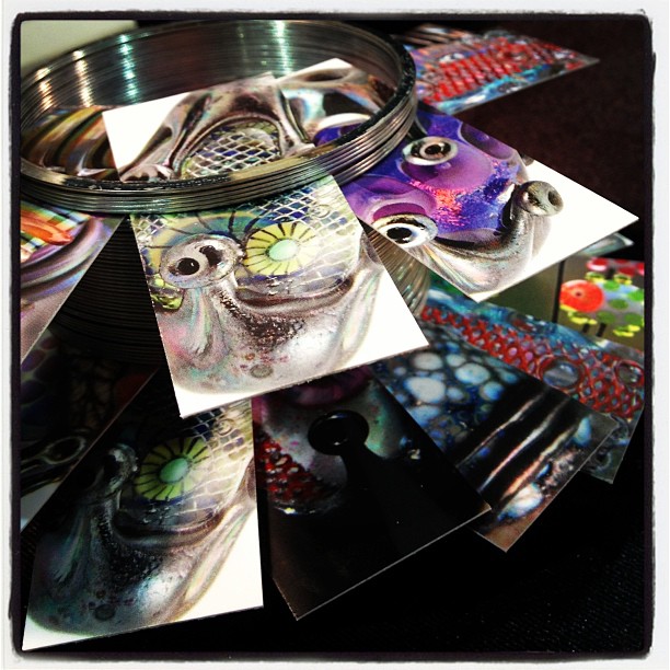
My business card holder.
My last order of mini Moo cards displayed in a slinky. 

Raise you hands if you love Moo business cards, but hate the prices! I'm right there with you.

I needed more business cards before Bead Fest this year and because that, along with another show I'm doing before Christmas are both high volume shows, I needs lots of cards. I adore the Printfinity technology Moo does (printing a different photo on each business card if that's what you want) and the gorgeous matte card stock. But sometimes the pricey Moo cards are also distracting. I can't even tell you how many times people have stopped to "shop the cards" to find the perfect photo, just to clog up my booth.

Karen Totten mentioned Got Print has a similar heavy matte paper that she's been really happy with and the prices are much less for a larger number of cards. So I gave them a try, had some bumps in the road, but it all worked out perfectly in the end.

With Got Print, not only do you have lots of paper selections (including the heavy matte paper I got), but you can also order several different shapes.


I stayed with the traditional business card size because I didn't want to spend a bunch of time figuring out how to design within a different shape.

I use Photoshop Elements to do the majority of my photo editing and designs, but it will not convert RGB to CMYK color. Vistaprint and Moo are fine if you don't convert, but Got Print insists that it's converted. I found this handy dandy free RGB to CMYK converter online, and it worked perfectly.


The biggest issue was caused by my full bleed photo on the back, and their method of cutting the cards. Because they do a high volume with a quick turn around, they do not wait as long for the cards to fully dry before cutting them.

The initial set of cards printed arrived with jagged cut edges on the bottoms. After chatting with someone at GotPrint, I learned some things about printing I didn't know, and also how to get around this jagged edge issue.

#1: the matte paper is more prone to this issue. Use glossy or a protective coating (which makes it glossy). Having glossy paper wasn't an option for me.

#2: the full bleed photo needs to be uploaded as the front side design (printed first) so it has a longer drying time. The other side has white space along all the edges, so it wasn't an issue.

#3: Don't use a full bleed photo.

They reprinted my cards free, and I went with option #2. It would have been an even better result if I had selected #1 and #2,  or #3, but I really love the matte paper AND the full bleed photo.


I'm very happy with the results. The previous batch, if you touched them or looked closely at them, you could feel the jagged edges on the bottom edge. The new batch isn't completely perfect, but you would need a magnifying glass to notice, and it isn't noticeable by touch. I don't remember the exact price I paid, but it was somewhere in the neighborhood of $30 for 1000 cards. For the paper quality and price, I can live with the trade-off of a minor imperfection on one edge.

Will I still use Moo? Absolutely. But it will be reserved for orders or gifts. Not for shows.


Tuesday, October 28, 2014

All Fired Up


In my last post I wrote about receiving a new kiln for my birthday.  I've had a chance to put it through its paces since then.  Before using the kiln to fire any actual ceramic work you are supposed to fire it empty one time and check to see if the heat work, (heat over time) is accurate or needs adjusting.

You do this use by using cones - no, not the kind that you want on a hot day.  The cones you see in the picture below measure if your kiln is heating properly.  There are different cones for different heat levels.
I wanted to do a cone 5 firing (2205F), so I placed a cone 4, cone 5 and cone 6 in my kiln.  After a cone 5 firing, the heat should cause the cone 4 to bend completely over, the cone 5 (my target) should bend quite a bit and form a sort of hook and the cone 6 should be straight or only very slightly bent.

I was online chatting with AJE team member, Karen Totten,  during my test firing.  We could both hardly wait to see the outcome.  I opened my kiln and Wha????  None of them were bent at all.  Panic!  We tried to figure out what had gone wrong.  Turns out that in my excitement I had set the temperature wrong.  Without going into a long explanation, there is a huge temperature difference between cone 05 and cone 5.  I'd set it at cone 05.  I knew better, but goofed up anyway.  Well better to have an operator error than a flaw in the kiln!  Here are the cone results, from the second firing.
Here's what the cone 5 looked like.  It needed to bend just a tad more, which means my kiln is running just a bit on the cool side. So I am now holding the temperature an additional 5 minutes to account for that.
 Ceramics are usually fired twice.  The first firing is at a lower temperature and the ceramic is called bisqueware after that firing.  The second firing is at a higher temperature and it bonds the glaze to the clay and makes the clay hard and strong.  The actual temperatures vary by the types of clay you are using and the effects you are aiming for.

I did a firing this week with 2 different clay bodies.  There were some earthenware beads that can be glazed at cone 05 and some stoneware that is bisque fired at 05. 

The red clay is stoneware that is ready to be bisque fired. Unfortunately I accidentally broke the large snowflake wall hanging when I lifted it off this tray to place it in the kiln.  The glazed pendants are also stoneware.  I had glazed fired them last week, but hadn't put the glaze on thickly enough and they needed touching up.  Because they had been glaze fired already, I had to fire them at a lower heat for the touch ups (with Mayco Coat & Stroke glaze).  The glazed earthenware beads can be glaze fired at cone 05, too.

 My kiln is built in layers, so it is easy to load.  I took off the top layers (see above) and put some of the pieces on the bottom shelf.    These pieces do not have glaze on their backs, if they did, the glaze would fuse to the shelf, ruining both the shelf and the pendants.
The earthenware beads have glaze on all sides, so they are suspended on a bead rack.  Notice how they are spaced.  If they touch one another, they will fuse together.  Once everything was in place, I replaced the top two layers of the kiln and started the heat.
The results?  The rounded triangle pieces didn't turn out very well.  They are fine structurally, but boring looking.  They will get banished to this tin.
 The red clay snowflakes look promising. I've used white Mason Stains on some of them.  I still need to wipe back a bit more of the white from the raised areas, but you can get an idea of what they will look like when they are glaze fired.

And here are the glazed beads.  Some of the beads, especially the brown ones, still need more coats of glaze.  Obviously its a matter of learning as I go.  I made a few simple beads in Christmas colors, but I especially like the blue color.  I went to a pottery store yesterday and got *more* colors of glaze.  Oh my, I see the beginning of a new color addiction...
-Linda

Monday, October 27, 2014

Soldered Wire Prong Bezels

On Saturday, I went up to Sue Sachs studio to take a bezel workshop.  This wasn't just any bezel workshop, it was on setting stones that were unusually shaped.  I asked specifically for this workshop because I have a large collection of cabochons and flatbacks that aren't round or oval.
Sue had a selection of samples laid out for us, including this massive wire prong bezel pendant.  Right away I knew I was going to make a bezel using this technique.  
I brought my entire collection of crystal and fossil cabochons with me but ultimately decided I would set this pretty quartz piece.  I also used the sterling silver wire I already had on hand, which included 16 gauge and 20 gauge (I would not use 20 gauge in the future though as it would need to be work-hardened to be secure).  I do plan to add 18 and 14 gauge to my supplies in the near future.
The first step was to create a base that I would then attach all the prongs to.  I used the 16 gauge wire for this.  Once the ends were filed, I soldered the wire together.
I then cut several lengths of 20 gauge wire and created balled headpins to use as the prongs.
I eyeballed the length of the headpins and cut them down in size and soldered the first two onto the base.
Then the final two prongs were measured and soldered on.
I noticed along the way I must have goofed and I had to flip the base around.  Oops.  But it was still going to work!
I went with a simple arch for the bail.  I also realized at this point that the bezel looked kind of like a baby reaching out to be held.  Hehe.
I gave the bezel a Liver of sulfur bath and then I slid the quartz in and folded the prongs over.  

This was an easy and fun way to set a stone!  Colin is going to finish getting my torch set up in the workshop so that I can begin making these at home.  

What's your favorite way to set unusually-shaped stones?

Happy Beading!

Diana P.

Sunday, October 26, 2014

Studio Comforts

I've spent much of the past week or so preparing my home for the arrival on Friday of decorators who are giving it a much needed top to bottom face lift. Because they are doing the whole house I was trying to make sure everything I needed could be accessed as the contents of each room inevitably get shuffled around the house...I've already failed on that score but more about that later.

Even thought my studio extension was only built last year it is included in the make over so that some settlement cracks can be fixed and the paintwork can be freshened up. I'm not a collector by nature but I while I was in there trying to get it organised I realised that this was the one area of the house where I do tend to hold on to things and my worktable is home to a little collection of ephemera. This got me  thinking and I asked my AJE team mates what they had in the their studio's that inspires them or keeps them focused. I was thinking artwork, memento's, books, signage...anything other than tools that helped them with their work. Well, their answers were far more interesting than mine so l decided to share them here in their own words since they are far more meaningful than anything I could write.

First up is this beautiful work in progress from Francesca which obviously holds deep significance for her...


Francesca says "This piece will never be finished, from a weekend's worth of classes I took with Thomas Mann two years ago. There's a lot of complicated stuff wrapped up in it for me, and it is nearly always in view when I'm working.  The photo is of my mother, who died much too young. This is my favorite photo of her.  The class with Tom was brutally hard but also hugely gratifying. This piece represents the moment when I broke through a mental block I'd had about using the jeweler's saw, and reminds me not to give up when I'm tackling something challenging.  I began to see jewelry design in a whole new light as a result of this weekend, both in terms of technique and content, and this piece reminds me to take a "no BS" approach to the work - especially when I am feeling a little too full of myself".

Karen sent me some photos full of intriguing things which clearly influence her design ethos...

"The first part of the image is my bear fetish from zuni pueblo that I bought when I was traveling in the area 23 years ago. This was a 3 week solo trip. I rented a jeep and traveled / camped throughout the southwest. Bear is a very important animal totem to me, for a number of reasons I won't go into here. And yes I do plan to make my own bear totem some day."

I think I may just have seen that bear totem come to life on Facebook this week...


"The lower part of this image shows my altar where I keep him along with other items from my medicine bundle. This is located on my main workbench so it is daily in front of me. The white statuette is Tara, a female bodhisattva in mahayana buddhist tradition. (http://www.wildmind.org/mantras/figures/greentara).I was named after the 3rd of 21 forms of Tara (Golden Tara or Sonam Dolma) by my lama back in the early 2000's when I was studying tibetan buddhism. Interestingly, the southwest pueblo culture, in particular the Hopi, and the Tibetans are connected: https://artofdharma.com/when-tibetans-are-scattered-throughout-the-world-the-dharma-will-come-to-the-land-of-the-red-man/... I only learned of this connection recently but it kind of fits with my studies. I am deeply inspired by these sources. Some of the symbols and forms that I use come from them.

The wooden cat figure is from my dad - from when he was on tour in SE Asia during the Viet Nam war (he was an AF navigator, flew KC135s)".


"The second image is of my personal medicine bundle, that I have carried with me since childhood (I didn't use to call it that - it was just my little mini cigar box of stuff). It contains a collection of rocks, fossils, items my kids made for me, etc. The red arrowhead has a story behind it... my brother Jake found it in a cave near our house in south St. Louis when he was a teenager and gave it to my dad, who put it on the fireplace mantle. My dad decided to give it to someone who he thought would like it (I don't remember who)... but weeks later it reappeared back on the mantle even though the person had not been back to visit since having received it. So... my dad next gave it back to Jake, and Jake gave it to a friend of his, but again, sometime later, it reappeared back on the mantle. At this time I was living in Cambridge MA, while attending school there. When I visited over the holidays, my dad gave the arrow to me. And it has stayed with me ever since. This was before I developed an interest in native culture, but I feel it was a precursor to that, a "sign" if you will...

As you can see many of the items have influenced my work - the textures, forms, etc.

Fascinating stuff Karen!

Now Caroline has just moved into a lovely purpose built studio and I know she has spent a lot of time getting it to be her perfect working environment and she has created a wall of special art work that has helped her do this...


"I am hugely inspired by the Scottish artist Pam Carter. I was introduced to her by a friend, who is sadly no longer with us, when she sent me a card with a print of one of her paintings. It was an image of the beach on the West Coast of Scotland where we met and became friends. I loved Pam's style and use of colour, so bought more of the cards for my new workshop. These sit on the wall next to my lamp work bench for a shot of colour inspiration and escapism when I need it"

Having spent time at Jenny's home this summer I new that her studio was full of things of deep meaning and significance to her and of course when I asked she came up with the goods..

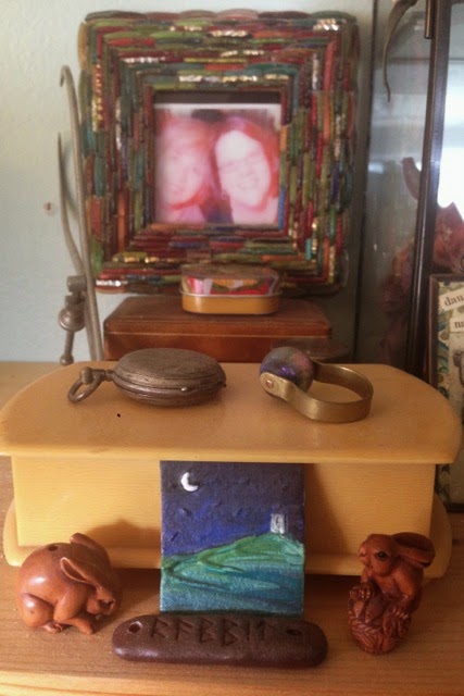
"I have a shelf right above my jewelry table - With a huge glass case of seeds, pods, shells, and other fragile natural inspiration. Next to that is this view. A runic charm made by a super talented fae friend. Rabbit netsukes - rabbits are my totem if you will, and a symbol of fertile creativity. A polymer landscape from a stamp I carved of Glastonbury Tor. This is a pilgrimage site to me and means quite a bit mythically and spiritually. A vintage celluloid box with treasures inside. And the frame? Me and my bestie Cooky taken by friend and mentor Keith LoBue a few years ago (in San Diego). Living in San Diego helped reorient me on the jewelry mixed media path, so their presence in my creative space is essential."


"My altar/meditation table set up for Fall and the Dia de los Muertos."


"On my work table: I believe in having feminine goddess/muse images in many places. This old bronze was an auction find. And flotsam and jetsam end up here: a shell fragment, a single labyrinth earring, a UK coin..."


If you'd like to know more about Jenny's inspirations keep and eye on her blog as I know she is planning to cover this in more detail there soon.

And what about me then...well I'm beginning to regret not having that collectors gene as I have nothing so interesting as these ladies. I do have a collection of my early work and pieces from all the jewellery making courses I've been on - sadly I cant show you these because one of those shufflings I mention earlier happened while I was out yesterday and my work table is now hidden behind a wall of furniture and kilns - epic planning failure there then!

Like Caroline I do have a favourite piece of art that anchors me to my home town which I see very little of these days. I was born in Welwyn Garden City, one of the first developments to come about as part of the garden city movement - "a method of urban planning that was initiated in 1898 by Sir Ebenezer Howard. Garden cities were intended to be planned, self-contained communities surrounded by "greenbelts", containing proportionate areas of residences, industry and agriculture" (Wikipedia)


This is a reprint of the posters that were created to sell houses in the town in 1940 designed by Charles Paine who also designed posters for the London Underground around that time. The posters - one for each season were reprinted in 1990 and I bought a complete set for my parents. When they passed away I took 'Autumn' and 'Winter' and my brother has 'Spring' and 'Summer'. I love the late Deco feel of this design and the bold lines and strong colours not to mention the subject matter. If only modern real estate advertising were so beautiful!

Once the decorating is done they will be off to have new mounts and then back in pride of place along with a couple of other projects I have planned. Having met so many talented creative people in recent years I've acquired a fair bit of art work which is sadly, mostly hidden in cupboards and drawers so I'm aiming to create a dedicated Artisan wall to display all these pieces....I think that will get a post of it's own in the future. I'm also planning to try and do something with my glaze test tiles which until recently I made as very rough and ready strips of clay like these...


More recently however I've been using a these wheel formats with a view to turning them into some sort of morphing art installation... maybe using magnets to attach them to a wall so that I can remove them to refer to and repostion as the mood takes me. Early days on that one yet and  need a lot more tiles but watch this space.


So I hope you enjoyed that little insight into some of our studios... what do you surround yourself with to make your working environment more comfortable or inspiring..? we'd love  to hear.

Lesley
The Gossiping Goddess