
As a reminder, these are the colors that Pantone determined will be big this Spring.

In monochrome, it might look like this, but that's pretty boring.

So today let's look at combining some of these colors with one another and other accent colors.
The Pantone color palette leans heavily toward greens this spring. Pantone chose Emerald as their color of the year. The other two greens are Tender Shoots and Grayed Jade.
I scoured Pinterest for inspiring color combinations that included these greens. You can find color inspirations anywhere, from shower curtains to print ads to interior design. Once you open your eyes to it, you will find the Pantone colors everywhere. Any of these sources can make you want to run straight to your studio and start designing.
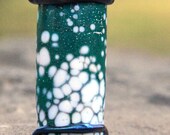
Here are some inspiring color combos that include emerald green. Think of malachite when you want an affordable emerald colored stone bead.


Serpentine is the perfect stone to use for the Tender Shoots color. Here are some Tender Shoots color combinations to whet your appetite.


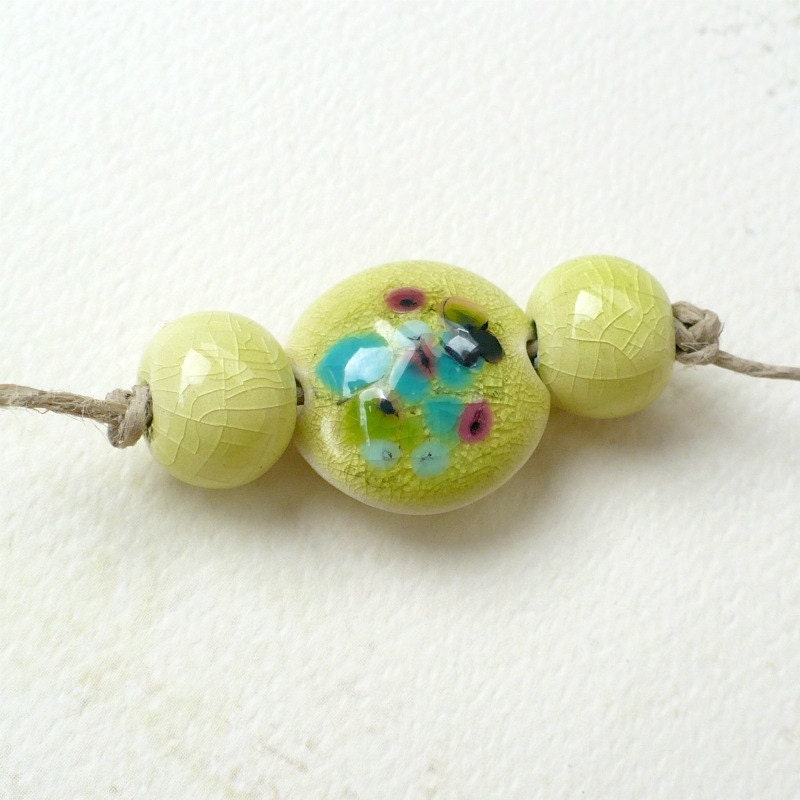
And finally, here are some combinations with Grayed Jade. I think of this as being the color of amazonite.


For even more color inspiration, visit my color board on Pinterest.
So now lets think of designing jewelry in all these luscious colors. Here's a color chart with some matching stones. This should help you get started, along with the stones I mentioned above.

Now its time to kick it up a notch by adding artisan beads and components!
This focal bead from Glass Addictions would make a striking centerpiece in an emerald green, white and yellow necklace!
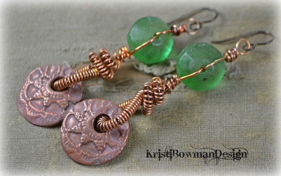
I love the combination of green and copper. It is a combination you might want to consider in your designs too. These gorgeous earrings come from Kristi Bowman Designs. She has loads of wonderful copper components too, to make your designs really unique. Picture wearing these earrings with a beige dress accented by a pretty green, peach and white silky scarf. Yum!
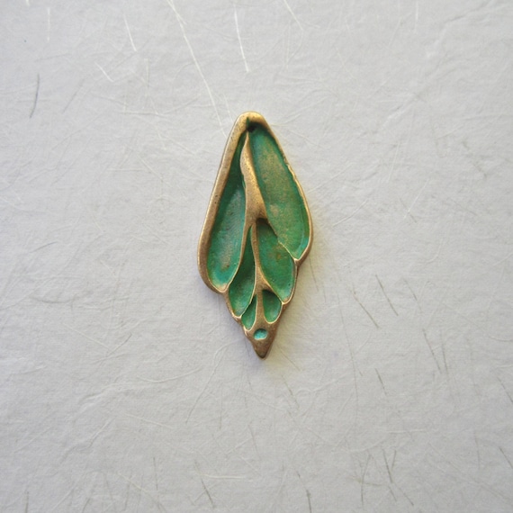
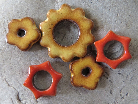
I love this bronze pendant from THEAtoo. I'm thinking that it would look awesome paired with the star components and the smaller flower links from Starry Road Studio, (pictured below).
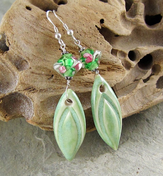
Here's a pair of earrings from Linda Landig Jewelry that is perfect for spring and summer wear.
For those of you on the east coast of the US, I assure you that even though you got a foot or two of snow last week spring will be coming. So don't despair. Just start designing your spring jewelry now. There's lots of inspiration here to kick start your imagination. Have fun!
P.S. Don't forget that the AJE Earring Challenge Reveal is this Sunday, Feb. 17th. The Linky Tool will be posted on our blog Saturday evening.
Linda Landig
Linda Landig Jewelry
Great post Linda. Thanx
ReplyDeleteOh WOW Linda! That is a treat for the eyes. Cannot wait to go through this post a few more times! Great Job!
ReplyDeleteOh Linda, so much yummy color. I think I'll need to read through it again just to take it all in. Great post!!
ReplyDeleteOh Linda, so much yummy color. I think I'll need to read through it again just to take it all in. Great post!!
ReplyDeleteWow! Very helpful information. Love it!
ReplyDeleteGreat post, Linda! I love green and am very happy it is the color of the year!
ReplyDeleteI looked at this over coffee, and then saved it for afternoon reading. Gorgeous pix, great ideas! I love it. The grey jade color to me is celadon - my favorite glaze! Glad to know one of my staple colors is (still) in style! (again?)
ReplyDeleteGreat post, Linda, jam packed with COLORful information!!
ReplyDeleteGreat blog! Green used to be my least favorite color, but not anymore! These pictures are beautiful!
ReplyDeleteI love looking at colors this way! It's really inspiring to which ones people mix and match and for what purpose!
ReplyDeleteAn amazing post Linda!! So many beautiful color combos!! So informative. Thank you so much.
ReplyDeleteBeautiful and inspiring!
ReplyDelete