Showing posts with label product photography. Show all posts

Friday, November 6, 2015

Foldio 2 Table Top Photo Studio Review

A few weeks ago, AJE team member, Diana P., mentioned that she was replacing her Foldio 1 with the larger Foldio 2.  I was like, "What in the heck is a Foldio?"
I learned that a Foldio is a portable light studio or light box (see picture above), available through Photojojo.  I did a little research and bought the larger Foldio 2 right away.  I already had a very good light box by E-Z Cube (see picture below), but it takes up a lot of space and we expect to be moving to a smaller home in January.
The Foldio has several innovative characteristics that are not to be found in a standard light box. As the name implies, if folds up easily and compactly.  My E-Z Cube folds up too, in principal, but its like wrestling with bed springs.  You have to twist it a certain way (that I never mastered), while pressing down, and then fold in the sides and slide it into a nylon bag, before it springs open again, like a Jack-In-A-Box.   Needless to say, it was just easier to leave my  E-Z Cube open at all times.

The Foldio is made of lightweight, corrugated plastic which unfolds into a cube shape with one open end. The sides of the cube overlap in the the same way as the folds on the bottom of an envelope do.  Each side is held in place by three powerful magnets.  If you look at the photo below  you can see the faint outline of the magnets on each tab. Pull the magnets apart and the cube folds flat in seconds.


 Because it folds up so easily,  I can simply fold it up and store it in the closet or on a bookshelf if I have guests over or if I need more working space.
 The Foldio lighting system is also innovative..  Both the Foldio 1 and 2 come with streamlined, inbuilt LED lighting.  The lights on the Foldio 1 run on batteries, so you can use it outdoors or anywhere, without requiring electricity - it is entirely portable in this sense.  The Foldio 2 is larger and has 2 rows of lights that run on electricity.  I turned my Foldio on its side, in the picture below, so I could photograph the 2 rows of tiny LED lights.  The round knobs on the right can dim or brighten the lights.  I love that feature!
My E-Z Cube (and every other light box system I've heard of) has separate lights, which are quite expensive. I couldn't afford the lights offered by the E-Z Cube company and so I jerry-rigged shop lights with high wattage daylight bulbs. My shop lights worked well, but they took up a lot of space.   My E-Z Cube and lights took up the entire top of bedroom dresser that you see in the first picture.

Since the lights on the Foldio are built in, they don't take up any extra room at all.  I love the extra space that I've gained on my dresser top, but I have to say that the Foldio lights are a mixed blessing.  The space savings and that fact that you can adjust the light intensity are big pluses! However, because the lights are built in at the top of the box, it is difficult to avoid casting shadows on the product item you are photographing.  With free-standing lights, you can set one on either side of the cube, which reduces shadows, plus you can move them around to adjust the angles of the lights.  With the Foldio, the lights are always up above and if you try to shoot downward, from above your product, your hand and camera will cast a shadow.  You can work around this, but I find it annoying.  If you decide to get a Foldio, I suggest lowering your camera to the height of the product you are photographing and then shoot straight at it.  If you want to take a shot from above,  hold the camera outside of the box (so your hands are not below the lights) and then use your zoom to get in closer.
 In summary, I think the Foldio, although not perfect, is going to meet my needs at the moment. It is perfect for someone with limited space and/or a limited budget.  I think the EZ Cube plus lights or a similar arrangement from another company, is a better option for the professional or someone with the necessary space.

~Linda
Linda Landig Jewelry


Thursday, April 17, 2014

Throw out that expensive camera

I refer to my iPhone 4S as a camera that is also a phone. With a few easy to learn skills, it's difficult to take a bad photo with an iPhone and several other brands of phones. I'm often surprised when people share bad photos they've taken with their phone, because these phones take such great pics. I share photos of my work taken with my phone all the time. I even use them in listings.

Don't get me wrong. I also use a nice camera to take product photos...specifically a Canon EOS Rebel XTi that I got about 7 years ago with a macro lens I've had for a little over a year. Since I got this phone, I find the process of taking photos, uploading to the computer, editing, then posting them online to be TEDIOUS. I've never had a desk job and find that I have a difficult time working on the computer more than 1 hour at any given time.

For example, I like how my headpins look held as a "bouquet" in my hand using my phone and  natural light, cropped, with no other editing:


Better than the photo of them in the photo tent using a macro lens:


To try to help you take better camera phone photos, I grabbed a couple pieces out of my jewelry box. I purposely took bad photos, then took better photos to illustrate the difference. 

Example #1

The first photo has at least two major problems. While there's natural light, it's direct late afternoon light, which is harsh, casts lots of shadows, and adds a lot of gold to the photo. Since I prefer to do as little editing as possible, the golden glow and shadows are unacceptable. The other big thing that's wrong is that the photo is just plain boring. The shot is too wide. 


These photos were all taken on my kitchen tile. So to correct for the shadows and gold color cast by the sun, I moved to an area that wasn't in a patch of sun. That is the ONLY difference I made. These photos are completely unedited. However, it's still boring (and completely uncropped). 


This next photo, the key is still in direct sun, but I've angled the phone and come in as far as I could for a more interesting shot. It makes a big difference to the interest level of the key, and the glass looks really sparkly in the sunlight. However, I do NOT like the shadows being cast for a product shot. If it was simply an "artsy" shot to share on Facebook or Instagram, this would be totally acceptable. 


The next photo of the key is close-up, slightly angled, and out of direct sun-light. The ONLY editing I did was to crop it into a square-ish shape. 


When trying to get up close and personal with your jewelry (or other product), it's best to get the camera as close as possible then crop further if needed. Do not use the zoom feature. Here's an overdramatized example. 

Original unedited uncropped photo taken too far away:


What happens when keeping the camera at the same distance but zooming in instead:


What happens when you crop the original photo taken at a super wide angle. The quality isn't perfect (because I cropped this an excessive amount as an example of the difference), but it's a heckuvalot better than the photo above.


Do you know how to crop your photos on your phone? 

On my phone, when looking at a photo, it looks like this. Click on the edit button at the bottom. 


Then perform the correct function. Crop is that overlapping square symbol on the bottom right. Flipping the photos (which I clearly did) is bottom left. 


Example 2:

What's wrong with this photo? Golden sun casting shadows. Some areas look washed out. The angle is too wide. 


The color and light is better, but the angle is too wide. And it looks like maybe I didn't focus this one where I wanted the focus to go. 


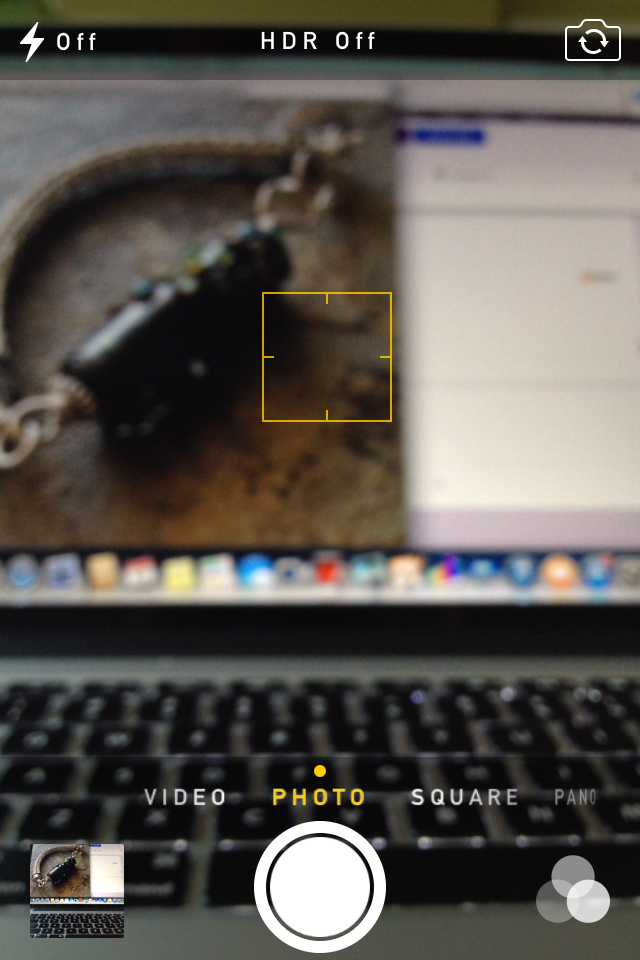
How does one adjust the focus? I can tell you how to do it on my phone, but it's kind of tricky to show it. Use your finger to touch the area of the screen on the object you want to focus on. The other thing this does is automatically adjusts the color/lighting to the object your focusing on to (usually) make it better. 

Here's a screen shot of the camera working on focusing right after I've touched a spot on the screen. The yellow square is the area I am having the phone focus on. Once it's focused, the square goes away. 


The next photo the bracelet fills the frame and isn't bathed in bright golden light. 


And remember that if you do super tight photos, you will want to show multiple views. 


And for the final example, I photographed this gorgeous beaded necklace by Kristen Stevens using one of my Nightmare Insomnia beads. Shadows, sun, too far away to see any of the detail that makes this necklace so special. 


The next one it has been removed from direct sunlight. The lack of shadows helps show a bit more of the detail, but it's still too far away to really draw the viewer in. 


And here is the focal portion with the camera held as close as possible and at a more interesting angle than straight above. You can now see more details in the piece than before. 


The above photo was cropped in Instagram. I used zero filters on it. If I'm selling a piece, I prefer to use no filters so the color looks as accurate as it possibly can. 

However, sometimes I use filters when I'm just showing a piece. I mostly like how the filters highlight certain areas of the photo and add a small border without any actual work. Below are three different filters of the photo above. Having comparisons like this can show you exactly how the filters change the look of the piece you're photographing. The change can be subtle, or striking.  

Mayfair:


Hudson: 


Sierra: 


In the above photo, we get a good look at the focal. But what about the rest? We (your potential customers) want to see the beading. And the clasp. So change the view, rearrange, move the phone. Here's another view of the same necklace above. The focal is blurred and moving off into the distance. The beading is front and center. Notice the empty space in front? All these aspects of the photo work together to create interest, tension, and to keep the viewer's eyes moving. 


And here is the same exact photo, but using the XPro filter on Instagram. It makes the background fade away and adds more emphasis to the beading. I love this look! 


Will I ever really throw out my digital SLR camera? Heck NO! But knowing how to take great photos with a smart phone really makes having an online presence easier. 

Go forth and take great photos!

-Jen Cameron


Sunday, March 16, 2014

Confessions

I don't know about you, but I have a love/hate affair with jewelry. I don't wear jewelry, apart from a promise ring, and I truthfully wouldn't wear most of the jewelry I make because it would require me to dress better and I'm not willing to do that. I find I enjoy thinking about making jewelry more than I enjoy actually making it. In fact, I often find myself procrastinating about the making part. And--apparently this makes me weird--I like photographing my jewelry even more than I like thinking about making it.

I also like to make photo backgrounds (as well as think about making photo backgrounds), and I love to shop antique stores and junk shops for interesting photo props. Here are some of my recent acquisitions: an old tin box, an old metal cup, some cast iron spoons and a fork, an Army belt, and some old sheep shears. I got that Army belt from a junk store--unfortunately it was brand new when I bought it, so I hung it over the fence last fall and left it there for a few months and it looks better now. I might put it back out there again for a while.
I love the process of creating a mysterious vignette for a photo ("Oh look, there is a necklace draped artistically among an Army belt, an old book, and some crusty sheep shears. There's GOT to be a fascinating story there..." Oh yes, yes there is. One day a soldier, a sheep rancher, a librarian and a transvestite walked into a bar...)
Lately I have become enamored of old, tattered book covers. The more splotched and stained the better. I especially love ones that are embossed, but they're hard to find in a sufficiently abused condition. It's amazing how hard it is to fake decades of wear and tear. (I tried adding some extra splotches with bleach, but these old books are amazingly resistant to chemicals. I'm thinking that bottle of muriatic acid in the cupboard might have a use after all...)
I actually think that my fascination with making photo backgrounds is one of my procrastination techniques. When I find myself having creative urges, but feeling reluctant to actually make jewelry, I do a photo background instead. It's my way of "circling." For a while I was into stenciling, to try to create a kind of wallpaper effect but it didn't work out the way I wanted. That's a damask stencil there from Stencil Ease.
Some of the ideas I've been toying with lately are faking up old stuff using assorted materials, because sometimes legitimate old stuff is hard to come by. For example, the weave on a flour sack towel (generally available at the grocery store) is just loose enough to resemble an old cloth book, or an old rustic tablecloth (plus they're relatively cheap). I glue them to a square of MDF (medium density fiberboard--you can get giant sheets at Home Depot and have them cut into smaller pieces)--this way they're ready to go when I need them and they don't get all wrinkled in a drawer somewhere.
For the two squares below, I painted one, and tea-stained the other. I added a strip of ribbon to the painted one to suggest a book binding (or something) and tried some faked up stains. I used acrylic paints. On the other, I stained it with tea bags and threw some lace from the fabric store across it, which I had also tea-stained. The lace isn't stained enough so I might have to singe it with an iron (I have experience with that).
Maybe I'll add a giant crusty key and a mug when I use the second one in a picture--"Look, I took a picture of this necklace on the kitchen table in an old farmhouse in Provence while the French people were having breakfast. They didn't mind."
I like the blue one too. Close-up, it could be an old bellboy uniform that's seen better days, or maybe a vintage photo album, or perhaps even the moth-eaten canopy on an old Victorian pram. (See, people will think you have awesome historical artifacts in your house with fascinating stories behind them. "Yes, my great grandfather was a bellboy and one day he walked into a bar with a soldier, a sheep rancher, a librarian and a transvestite...")
--
Here is a sedimentary rock or Mediterranean stucco experiment, depending. It ended up looking more like a frosted cake than Mediterranean stucco. I am thinking of putting sprinkles on it.
I also like using framed pictures as backgrounds. I've had these picture frames below forever, but I haven't gotten around to using them because I hate the colors and need to repaint them, but I can't make up my mind what colors to paint them. I'm putting old family photos in them. For now I've just printed the photos on my laser printer to give you an idea, but I will need to have them printed on photo paper. I've found that photos work better as backgrounds if they have more white space in them, so the two at the bottom might not work.
I like to use them like this:
Or with just a corner of a frame showing:
I got these really cool embossed papers from 32NorthSupplies. I thought I could glue them onto a piece of wood or MDF and then paint over them and make them look like faked up embossed book covers or faked up (are you sensing a theme here) architectural details from some posh but dilapidated pied-a-terre. Or something. Something mysterious. The cool thing about using stuff like this in jewelry photography, is that it's so close up, it's not necessary for the person looking at it to know what it is; it only needs to look vaguely interesting. It's all about suggestion. Maybe that's what I like about doing these backgrounds--they're not literal, identifiable things, they're just vague suggestions. I am a big fan of vague suggestions. (Like, "Maybe you would enjoy taking a long walk off a short pier?")
This actually ended up looking more like whitework embroidery to me. I'm going to go over it with more paint and maybe some gilder's paste to bring out the detail and give it a more worn and aged look. Or maybe I'll just hang it on the fence with the Army belt.
I also bought some cheap placemats a few years ago thinking they might make interesting photo backgrounds, but I didn't like the colors. I decided to paint them. I have no idea if these will look right with jewelry on them but they worked well as a jewelry-making avoidance technique. If they don't work, I'll hang them on the fence with the Army belt and see what happens.
Well, today is my birthday, and I am going to reward myself by doing whatever I want so I'm off to the grocery store to buy sprinkles for my Mediterranean stucco cake.