
The Pantone Color Institute produces authoritative quarterly color forecasts. Their forecasts predict which colors will be on trend in fashion, graphics and industry for the upcoming season.
The ten colors you see below will be the hot women's fashion colors for spring 2013. There are 3 shades of green, 2 shades of blue and then 5 other colors. It's fun to think about mixing and matching these colors with what is already in your closet. Most of us can't run out and get a new wardrobe to match whatever is "in" at the moment, but it's easy to update an older outfit just by adding jewelry or other accessories in the spring 2013 colors.

I thought it would be fun to highlight some finished jewelry as well as some art beads and components that match these trending colors.
The ten colors you see below will be the hot women's fashion colors for spring 2013. There are 3 shades of green, 2 shades of blue and then 5 other colors. It's fun to think about mixing and matching these colors with what is already in your closet. Most of us can't run out and get a new wardrobe to match whatever is "in" at the moment, but it's easy to update an older outfit just by adding jewelry or other accessories in the spring 2013 colors.
This lovely Dusk Blue bracelet bar by Karen Totten of Starry Road Studio would look great with jeans. When designing the bracelet, you could accent the focal with Monaco Blue and maybe a little pop of Emerald or even Nectarine!

If you know me, then you know that I love the color orange in all its variations, which is why I love the Nectarine color in this spring's palette. Here's a bracelet by Melissa Merman of Melismatic Art Jewelry that I would be wearing all the time!

From Jenny Davies-Reazor comes this Woodland Fairy Forest Sprite focal. This delightful pendant picks up on the deep Monaco Blue and accents it with the fairy wings in Tender Shoots. I can see this being strung with some serpentine or aventurine and sodalite, can't you?

These tiny winged heart charms from Tree Wings Studio combine Pantone's Nectarine (or a shade close to it) and Poppy Red colors. They would make perfect Valentine's Day earrings.

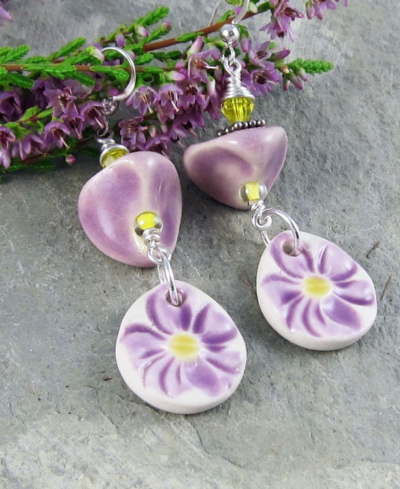
Lastly, I'll share a pair of my earrings, that I made with ceramic components from Marti's Buttons and Beads. These African Violet colored earrings are accented with Lemon Zest highlights. This color combination always makes me think of the purple irises I raised as a child and that, in turn, always makes me smile.
There are colors I haven't touched on yet. If you'd like to see more art jewelry and art jewelry elements in the Pantone colors for spring, let me know in the comments. If there is an interest, I'll do a follow up post next time.
Just a reminder, the first AJE Earring Challenge reveal will by this Sunday, Jan. 20th!
Linda
I'm interested in another post - loved this post (I'm so excited about Spring being on its way).
ReplyDeleteOh boy - new colors to play with! Thanks for posting and sharing my bracelet focal! xoxo
ReplyDeleteThank you Linda for sharing my components. You did such a lovely job with the wonky beads! I think I will make more!
ReplyDeleteI love that emerald green! Green isn't usually my colour, but this shade is lovely, very wearable and less harsh than greens can be.
ReplyDeleteWOW those are some gorgeous colors!!! Hummmmmm all these in beaded beads is what I am thinking!
ReplyDeleteThese would make gorgeous beaded beads! Can't wait to see your creations!
DeletePlease! More posts on Pantone's spring colors would be great! (We had purple irises in our backyard when I was growing up - what fun memories your earrings brought back!)
ReplyDeleteLove this post! And I've been loving the greyed jade - working on a few things that feature it. Thanks for sharing some inspiration!!!
ReplyDeleteLove this post! And I've been loving the greyed jade - working on a few things that feature it. Thanks for sharing some inspiration!!!
ReplyDelete