I've been "living" in my new Roadhouse Arts studio space for almost four months now, and while there's a lot that I really love about it, there are also some things that aren't working for me.
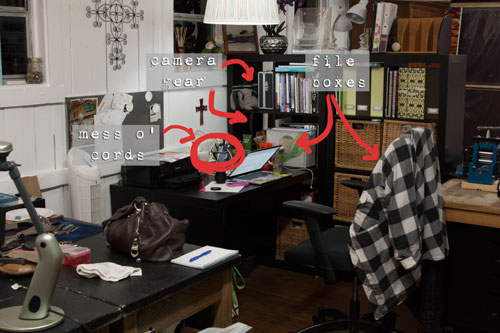
My little admin area needs to be reworked. I spent a huge chunk of the day yesterday working through the paperwork that had accumulated, both for my own business and the Roadhouse side of things, and everything is caught up. While that makes me happy, I think the backlog started because the workflow wasn't well-organized to begin with.
I have two file boxes now, and the segregation of things will help. The smaller one contains the stuff I get into more frequently; the larger one is longer-term. But I still don't have the right space to stash either of them - my camera bag and equipment is taking up two entire cubbies in my wall unit. And I don't like the nest of cables and power strips on top of the desk. I just ordered this remote switch and I'm hoping it will solve the problem while still allowing me to turn lights on and off without having to crawl under my desk.
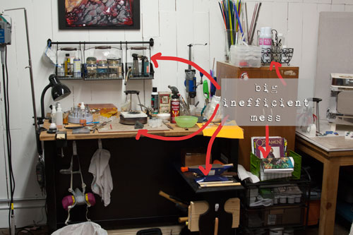
My metals and fabrication area would benefit from a little tweaking. I have an Ikea kitchen island set up for sawing and soldering, so I can see things close up without having to bend over or wear my magnifiers. The problem is that most of the great storage the unit includes (two metal shelves) is pushed up against the wall so I can't get to it.
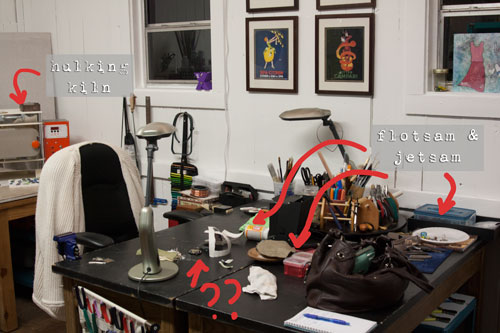
I also have two old science tables pushed back-to-back that are supposed to be for layout, design and fabrication work, but as you can see from the photo, they wind up being a collection area for all manner of flotsam and jetsam that have little to do with current projects.
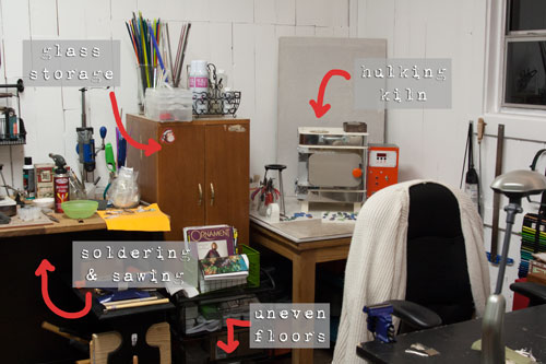
I had convinced myself that rolling my chair between the two stations would be fine, but the truth is that the floors in this old building are so unlevel that "rolling" is an exercise in frustration. This also makes pulling the island unit out to get at the long-term storage a serious pain in the neck, because everything (and I mean every.single.thing) has to be shimmed to within an inch of its life in order to avoid punches, beads, wire and any other curved or roll-ey thing from just making a run for it the moment it gets set down.
And then there's my kiln and glass area, which just sort of squat in the corner taking up a bunch of room. I don't think it's an efficient use of space, but I'm kind of stuck because that's where I had the dedicated plug installed for the kiln. And I don't think I'm making the best use of the space along the one main wall.
I'm considering a pretty significant reorganization that includes separating the two science tables and using one to create an "L" shape with the island sticking out into the space. This would put the storage shelves on the island facing my admin area, where I could use the extra storage. The other science table would go where the island was and be primarily for mixed media work. (That's a subject for another post. "Living" with mixed media artists is starting to mess with my head, I tell you!!) I could also use it for larger project layouts, when I have multiple or complex pieces going.
So... any suggestions? I'm really open to any and everything - the space just isn't working well, and it's not because I don't have enough to work with. Let me know what you think and I'll update you in a future post.
Until next time -


Getting a work area set up just right for you and your art isn't easy. One thing that helps me is to have all my work surfaces the same height. That way I can see everything the bulk of the time. I also like to keep as much as possible on shelves at my eye level and a bit above. No bending unless it's something you use no more than once a month. I'm not lazy but once I get in that chair I like to stay put till I am done or need a break - not to get something I need to work with. I like every tool and material to be within reach. I also use a tool box next to my work bench - the big red multi drawer things. They don't take up much floor space but really hold a ton of stuff. My drill press sits on top. What works for me may never work for another jewelry/creative person's space but this is what helps me. Good luck with getting your happy place set up the way you want.
ReplyDeleteWell even though it's frustrating for you, I have to say I love the look of the white-painted rough-hewn plank walls! I've been sucked into looking at scandinavian interiors and have really fallen in love with white-painted wood surfaces--floors, walls, ceilings, all of it!
ReplyDeleteIt's tough getting the workspace flow just right for creating and it does seem to change through out the year(s), but I was happy to see what looks to be a HEPA purifier over by your desk in the first photo! Gotta have that!!
ReplyDelete